Assess network impact of lesion
In [1]:
# ConWhAt stuff
from conwhat import VolConnAtlas,StreamConnAtlas,VolTractAtlas,StreamTractAtlas
from conwhat.viz.volume import plot_vol_scatter

# Neuroimaging stuff
import nibabel as nib
from nilearn.plotting import (plot_stat_map,plot_surf_roi,plot_roi,
                             plot_connectome,find_xyz_cut_coords)
from nilearn.image import resample_to_img

# Viz stuff
%matplotlib inline
from matplotlib import pyplot as plt
import seaborn as sns

# Generic stuff
import glob, numpy as np, pandas as pd, networkx as nx
from datetime import datetime
/global/home/hpc3230/Software/miniconda2/envs/jupyter/lib/python2.7/site-packages/h5py/__init__.py:36: FutureWarning: Conversion of the second argument of issubdtype from `float` to `np.floating` is deprecated. In future, it will be treated as `np.float64 == np.dtype(float).type`.
  from ._conv import register_converters as _register_converters
We now use the synthetic lesion constructed in the previous example in a ConWhAt lesion analysis.
In [2]:
lesion_file = 'synthetic_lesion_20mm_sphere_-46_-60_6.nii.gz' # we created this file from scratch in the previous example
Take another quick look at this mask:
In [3]:
lesion_img = nib.load(lesion_file)
plot_roi(lesion_file);
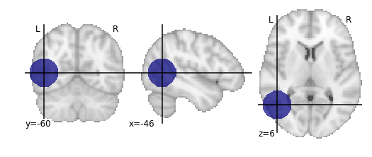
Since our lesion mask does not (by construction) have a huge amount of spatial detail, it makes sense to use one of the lower-resolution atlas. As one might expect, computation time is considerably faster for lower-resolution atlases.
In [4]:
cw_atlases_dir = '/global/scratch/hpc3230/Data/conwhat_atlases'  # change this accordingly
atlas_name = 'CWL2k8Sc33Vol3d100s_v01'
atlas_dir = '%s/%s' %(cw_atlases_dir, atlas_name)
See the previous tutorial on ‘exploring the conwhat atlases’ for more info on how to examine the components of a given atlas in ConWhAt.
Initialize the atlas
In [5]:
cw_vca = VolConnAtlas(atlas_dir=atlas_dir)
loading file mapping
loading vol bbox
loading connectivity
Choose which connections to evaluate.
This is normally an array of numbers indexing entries in
cw_vca.vfms.
Pre-defining connection subsets is a useful way of speeding up large analyses, especially if one is only interested in connections between specific sets of regions.
As we are using a relatively small atlas, and our lesion is not too extensive, we can assess all connections.
In [6]:
idxs = 'all' # alternatively, something like: range(1,100), indicates the first 100 cnxns (rows in .vmfs)
Now, compute lesion overlap statistics.
In [18]:
jlc_dir = '/global/scratch/hpc3230/joblib_cache_dir' # this is the cache dir where joblib writes temporary files
lo_df,lo_nx = cw_vca.compute_hit_stats(lesion_file,idxs,n_jobs=4,joblib_cache_dir=jlc_dir)
computing hit stats for roi synthetic_lesion_20mm_sphere_-46_-60_6.nii.gz
This takes about 20 minutes to run.
vca.compute_hit_stats() returns a pandas dataframe, lo_df,
and a networkx object, lo_nx.
Both contain mostly the same information, which is sometimes more useful in one of these formats and sometimes in the other.
lo_df is a table, with rows corresponding to each connection, and
columns for each of a wide set of statistical
metrics
for evaluating sensitivity and specificity of binary hit/miss data:
In [28]:
lo_df.head()
Out[28]:
| metric | ACC | BM | F1 | FDR | FN | FNR | FP | FPR | Kappa | MCC | MK | NPV | PPV | TN | TNR | TP | TPR | corr_nothr | corr_thr | corr_thrbin |
|---|---|---|---|---|---|---|---|---|---|---|---|---|---|---|---|---|---|---|---|---|
| idx | ||||||||||||||||||||
| 0 | 0.990646 | 0.104859 | 0.098135 | 0.911501 | 29696.0 | 0.889874 | 37851.0 | 0.005266 | 0.330534 | 0.094054 | 0.084363 | 0.995864 | 0.088499 | 7149810.0 | 0.994734 | 3675.0 | 0.110126 | 0.042205 | 0.042205 | 0.094054 |
| 3 | 0.987324 | 0.011683 | 0.014279 | 0.988855 | 32708.0 | 0.980132 | 58828.0 | 0.008185 | 0.329134 | 0.008766 | 0.006577 | 0.995433 | 0.011145 | 7128833.0 | 0.991815 | 663.0 | 0.019868 | -0.001487 | -0.001487 | 0.008766 |
| 7 | 0.987160 | -0.006617 | 0.001185 | 0.999075 | 33316.0 | 0.998352 | 59404.0 | 0.008265 | 0.329023 | -0.004966 | -0.003727 | 0.995348 | 0.000925 | 7128257.0 | 0.991735 | 55.0 | 0.001648 | -0.003549 | -0.003549 | -0.004966 |
| 10 | 0.994367 | -0.000926 | 0.000147 | 0.999589 | 33368.0 | 0.999910 | 7305.0 | 0.001016 | 0.331450 | -0.001976 | -0.004215 | 0.995374 | 0.000411 | 7180356.0 | 0.998984 | 3.0 | 0.000090 | -0.001975 | -0.001975 | -0.001976 |
| 11 | 0.989105 | 0.048907 | 0.044941 | 0.962227 | 31520.0 | 0.944533 | 47152.0 | 0.006560 | 0.329846 | 0.040403 | 0.033378 | 0.995605 | 0.037773 | 7140509.0 | 0.993440 | 1851.0 | 0.055467 | 0.017664 | 0.017664 | 0.040403 |
Typically we will be mainly interested in two of these metric scores:
TPR - True positive (i.e. hit) rate: number of true positives,
divided by number of true positives + number of false negatives
corr_thrbin - Pearson correlation between the lesion amge and the
thresholded, binarized connectome edge image (group-level visitation
map)
In [27]:
lo_df[['TPR', 'corr_thrbin']].iloc[:10].T
Out[27]:
| idx | 0 | 3 | 7 | 10 | 11 | 13 | 14 | 15 | 18 | 19 |
|---|---|---|---|---|---|---|---|---|---|---|
| metric | ||||||||||
| TPR | 0.110126 | 0.019868 | 0.001648 | 0.000090 | 0.055467 | 0.002128 | 0.000569 | 0.000000 | 0.098469 | 0.023523 |
| corr_thrbin | 0.094054 | 0.008766 | -0.004966 | -0.001976 | 0.040403 | 0.005801 | 0.000641 | -0.002543 | 0.169234 | 0.029414 |
We can obtain these numbers as a ‘modification matrix’ (connectivity matrix)
In [33]:
tpr_adj = nx.to_pandas_adjacency(lo_nx,weight='TPR')
cpr_adj = nx.to_pandas_adjacency(lo_nx,weight='corr_thrbin')
These two maps are, unsurprisingly, very similar:
In [104]:
np.corrcoef(tpr_adj.values.ravel(), cpr_adj.values.ravel())
Out[104]:
array([[1.        , 0.96271946],
       [0.96271946, 1.        ]])
In [79]:
fig, ax = plt.subplots(ncols=2, figsize=(12,4))

sns.heatmap(tpr_adj,xticklabels='',yticklabels='',vmin=0,vmax=0.5,ax=ax[0]);

sns.heatmap(cpr_adj,xticklabels='',yticklabels='',vmin=0,vmax=0.5,ax=ax[1]);
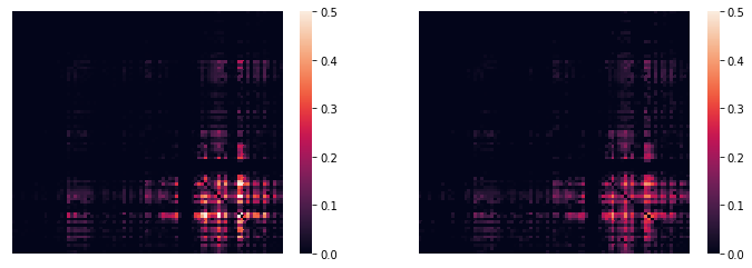
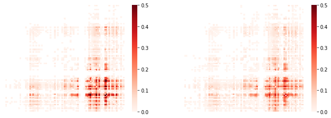
(…with an alternative color scheme…)
In [70]:
fig, ax = plt.subplots(ncols=2, figsize=(12,4))

sns.heatmap(tpr_adj, xticklabels='',yticklabels='',cmap='Reds',
                   mask=tpr_adj.values==0,vmin=0,vmax=0.5,ax=ax[0]);

sns.heatmap(cpr_adj,xticklabels='',yticklabels='',cmap='Reds',
                   mask=cpr_adj.values==0,vmin=0,vmax=0.5,ax=ax[1]);
We can list directly the most affected (greatest % overlap) connections,
In [85]:
cw_vca.vfms.loc[lo_df.index].head()
Out[85]:
| name | nii_file | nii_file_id | 4dvolind | |
|---|---|---|---|---|
| idx | ||||
| 0 | 61_to_80 | vismap_grp_62-81_norm.nii.gz | 0 | NaN |
| 3 | 18_to_19 | vismap_grp_19-20_norm.nii.gz | 3 | NaN |
| 7 | 45_to_48 | vismap_grp_46-49_norm.nii.gz | 7 | NaN |
| 10 | 19_to_68 | vismap_grp_20-69_norm.nii.gz | 10 | NaN |
| 11 | 21_to_61 | vismap_grp_22-62_norm.nii.gz | 11 | NaN |
To plot the modification matrix information on a brain, we first need to some spatial locations to plot as nodes. For these, we calculate (an approprixation to) each atlas region’s centriod location:
In [101]:
parc_img = cw_vca.region_nii
parc_dat = parc_img.get_data()
parc_vals = np.unique(parc_dat)[1:]

ccs = {roival: find_xyz_cut_coords(nib.Nifti1Image((dat==roival).astype(int),img.affine),
                                   activation_threshold=0) for roival in roivals}
ccs_arr = np.array(ccs.values())
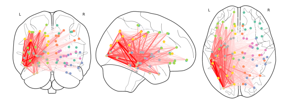
Now plotting on a glass brain:
In [ ]:
fig, ax = plt.subplots(figsize=(16,6))
plot_connectome(tpr_adj.values,ccs_arr,axes=ax,edge_threshold=0.2,colorbar=True,
                    edge_cmap='Reds',edge_vmin=0,edge_vmax=1.,
                    node_color='lightgrey',node_kwargs={'alpha': 0.4});
#edge_vmin=0,edge_vmax=1)
In [118]:
fig, ax = plt.subplots(figsize=(16,6))
plot_connectome(cpr_adj.values,ccs_arr,axes=ax)
Out[118]:
<nilearn.plotting.displays.OrthoProjector at 0x7f454cea5b90>